
Monday, July 10, 2006
Chung Charts, the Millar Line, and me


Supafamous pointed out that I got mentioned in the TdF Blog for a goofy joke I've been posting to rec.bicycles.racing.
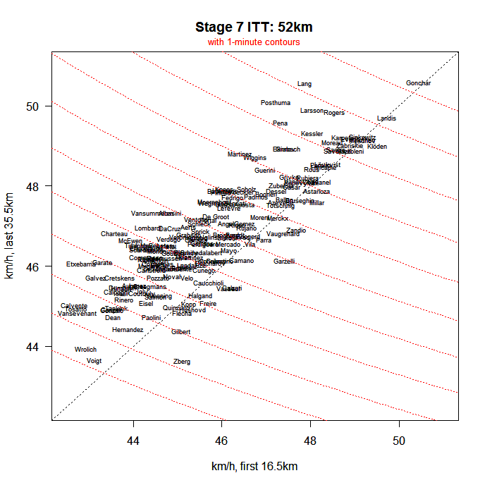
Ahem. So there we go. The charts above were done by Robert Chung, a dab hand with statistical visualization and a regular in rbr. You'll probably have to open the full-sized versions to figure out what's going on. This is a couple of graphs of the Stage 7 Time Trial that happened in the Tour de France on Saturday. TTs are key elements of the race, since that and the mountain stages are where favourites can make real time gains on their opponents.
It's often interesting to see how a rider's pace was in the first and last parts of the TT, since this tells you whether they went too hard early and blew up in the second bit, or whether they didn't go hard enough and had lots left in the second half (arguably preferable, though I think the idea is to go hard all the way through.
The reason the first chart highlights David Millar's result in red is because of my Millar Line jokes referenced in the rbr posts I mentioned. As for the second two charts, here's what Robert said:
"As long as I'm at it, here are two other plots that show that Gonchar dogged it for the last leg (he caught Kessler just before the third time check but didn't pass him until inside the final km), and a comparison of the first and last legs that shows Lang went out pretty slow considering how fast he finished."
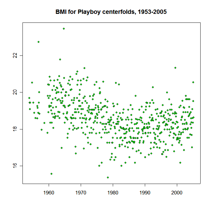
Robert has also done illuminating charts on things like power meters, posting levels in rec.bicycles.racing (huge spike in July), and the Body-mass indices of some very special groups of people.
He's very Tuftean.
Comments:
Post a Comment
![]()
